


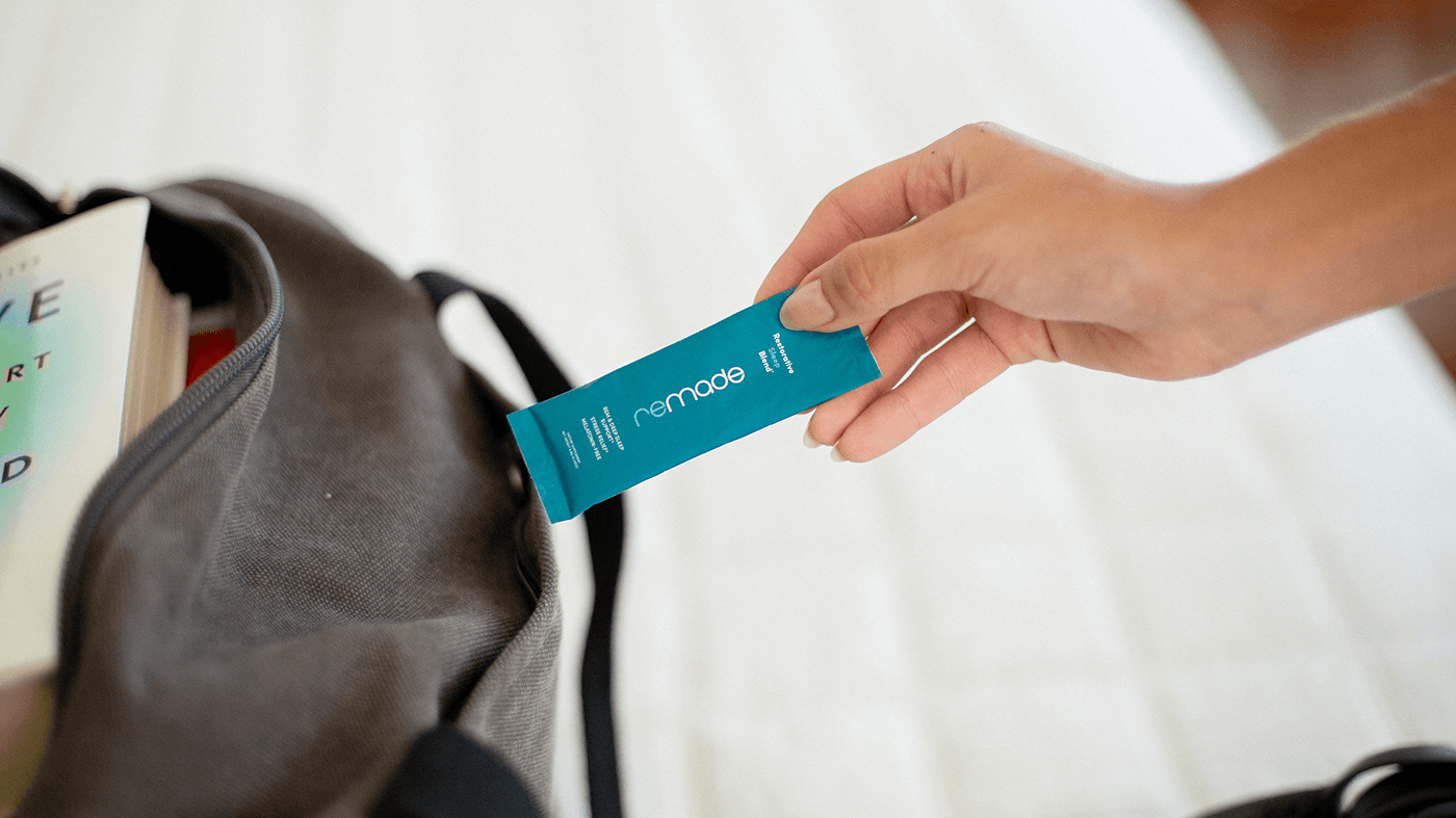
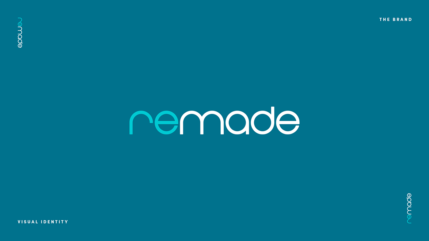

In a world that often undervalues the importance of quality sleep, Remade was created to shift the paradigm. Remade believes that a well-rested life is a better life, and it was made to help people achieve that. Remade’s logo is a harmonious fusion of friendly tranquility and modern appeal. It effortlessly captures the essence of sleep health in a design that resonates with health-conscious millennials. The soothing color palette and soft, rounded lines evoke a sense of calm, while the "re" in the logo stands out in a different color, symbolizing our brand's commitment to "remaking" your sleep, infusing fresh energy into the restful experience. Remade’s logo is more than just an emblem; it's a visual testament to our dedication to revitalizing your sleep journey.


